
Тема: CSS Battle
Після знайомства з cssbattle.dev захотів пройти кілька прикладів. Ділюсь результатами.
▼Battle #1

▼розвязок
<style>
    * {
        background: #5d3a3a;
    }
    body {
        background: #b5e0ba;
        width: 200px;
        height: 200px;
        margin: 0;
    }
</style>
▼розвязок
<style>
    body {
        background: #fdc57b;
        background-position: 50px 50px;
        background-size: 100vw 100vh;
        background-image:
            repeating-linear-gradient(
                to right,
                transparent 0,
                transparent 50px,
                #62374e 50px,
                #62374e 250px
            ),
            repeating-linear-gradient(
                to bottom,
                transparent 0,
                transparent 50px,
                #62374e 50px,
                #62374e 150px
            );
    }
</style>
▼розвязок
<style>
    body {
        background: #6592CF;
        background-size: 300px 300px;
        background-repeat: no-repeat;
        background-position: 50px 0;
        background-image:
            linear-gradient(
                to bottom,
                #6592CF 75px,
                transparent 75px,
                transparent 225px,
                #6592CF 225px
            ),
            radial-gradient(
                closest-side,
                #EEB850 25px,
                #243D83 25px,
                #243D83 75px,
                #6592CF 75px,
                #6592CF 125px,
                #243D83 125px
            );
    }
</style>
▼розвязок
<div></div>
<div></div>
<div></div>
<style>
    body {
        background: #62306D;
        margin: 50px;
        display: flex;
    }
    div {
        width: 100px;
        height: 200px;
        border-radius: 50px;
        background: #F7EC7D
            linear-gradient(
                to bottom,
                #62306D 100px,
                #F7EC7D 100px
            );
    }
    :nth-child(odd) {
        transform: scaleY(-1);
    }
</style>
▼розвязок
<main><div></div></main>
<style>
    body {
        background: #0B2429;
        margin: 30px;
    }
    main {
        width: 240px;
        height: 240px;
        margin: auto;
        border-radius: 60px;
        overflow: hidden;
    }
    div {
        background: #F3AC3C;
        position: relative;
        width: 50%;
        height: 50%;
        top: 50%;
        border-radius: 50% 0;
        box-shadow: 60px -60px #998235,
            120px -120px #F3AC3C;
    }
</style>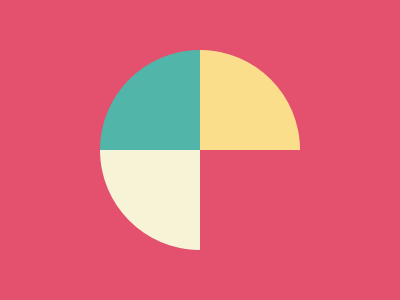
▼розвязок
<div></div>
<style>
    body {
        background: #E3516E;
    }
    div {
        width: 200px;
        height: 200px;
        margin: 50px auto;
        border-radius: 50%;
        background-image:
            conic-gradient(
                #FADE8B 90deg,
                #E3516E 90deg,
                #E3516E 180deg,
                #F7F3D7 180deg,
                #F7F3D7 270deg,
                #51B5A9 270deg
            );
    }
</style>
▼розвязок
<style>
    * {
        background: #0B2429;
    }
    body {
        background: #F3AC3C;
        margin: 75px;
        position: relative;
        width: 150px;
        height: 50%;
        left: 100px;
        border-radius: 100px 0;
        box-shadow:
            -50px 0 #998235,
            -100px 0 #1A4341;
    }
</style>
▼розвязок
<style>
    * {
        background: #6592CF;
    }
    body {
        background: #060F55;
        height: 140px;
        margin: 110px 130px 50px 130px;
        border-radius: 0 0 50% 50%;
    }
    body::before {
        content: '';
        position: relative;
        display: block;
        background: #060F55;
        width: 20px;
        height: 110px;
        margin: auto;
        top: 90px;
        border-radius: 10px;
        box-shadow:
            -60px -150px #060F55,
            -40px -150px #6592CF,
            -20px -150px #060F55,
              0px -150px #6592CF,
             20px -150px #060F55,
             40px -150px #6592CF,
             60px -150px #060F55;
    }
</style>
▼розвязок
<div></div>
<style>
    body {
        background:
            linear-gradient(
                to bottom,
                #222730 75px,
                #4CAAB3 75px,
                #4CAAB3 225px,
                #222730 225px
            );
        margin: 25px auto;
    }
    div {
        background:
            radial-gradient(
                closest-side,
                #393E46 25px,
                #4CAAB3 25px
            );
        border: #222730 solid 50px;
        height: 150px;
        margin: 0 75px;
        transform: rotate(45deg);
    }
</style>
▼розвязок
<div></div>
<div></div>
<div></div>
<style>
    body {
        background: #62306D;
        margin: 50px;
        display: flex;
    }
    div {
        background: #AA445F;
        width: 60px;
        height: 60px;
        position: relative;
        border: 20px solid #E38F66;
        border-radius: 50%;
    }
    div:nth-child(odd) {
        background: #E38F66;
        border-color: #AA445F;
        top: 100px;
    }
    div::before {
        background: #F7EC7D;
        content: '';
        width: 100px;
        height: 200px;
        top: 50%;
        left: -20px;
        position: absolute;
        z-index: -1;
    }
</style>
▼розвязок
<div></div>
<div></div>
<style>
    body {
        background:
            radial-gradient(
                closest-side,
                #84271C 25px,
                #191210 25px,
                #191210 50px,
                #ECA03D 50px,
                #ECA03D 70px,
                #191210 70px
            );
        background-size: 300px 300px;
        background-position: 50px 0;
        margin: 50px 0;
        display: flex;
    }
    div {
        border: 20px solid transparent;
        border-top-color: #ECA03D;
        border-left-color: #ECA03D;
        border-radius: 50%;
        margin: 50px;
        width: 60px;
        transform: rotate(45deg);
    }
    div:first-child {
        transform: rotate(225deg);
    }
</style>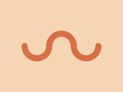
▼розвязок
<div></div>
<div></div>
<div></div>
<style>
    body {
        background: #F5D6B4;
        margin: 110px 80px;
        display: flex;
    }
    body::before, body::after {
        content: '';
        background: #D86F45;
        position: relative;
        width: 20px;
        height: 20px;
        top: 40px;
        margin: -10px;
        border-radius: 50%;
    }
    div {
        border: 20px solid transparent;
        border-top-color: #D86F45;
        border-left-color: #D86F45;
        border-radius: 50%;
        margin: -10px;
        width: 60px;
        transform: rotate(45deg);
    }
    div:nth-child(odd) {
        transform: rotate(225deg);
    }
</style>